Abdussalam Popoola
England, UK
A design engineer obsessed with crafting & building aesthetic & useful software products.
Works
Side Projects
Get in touch
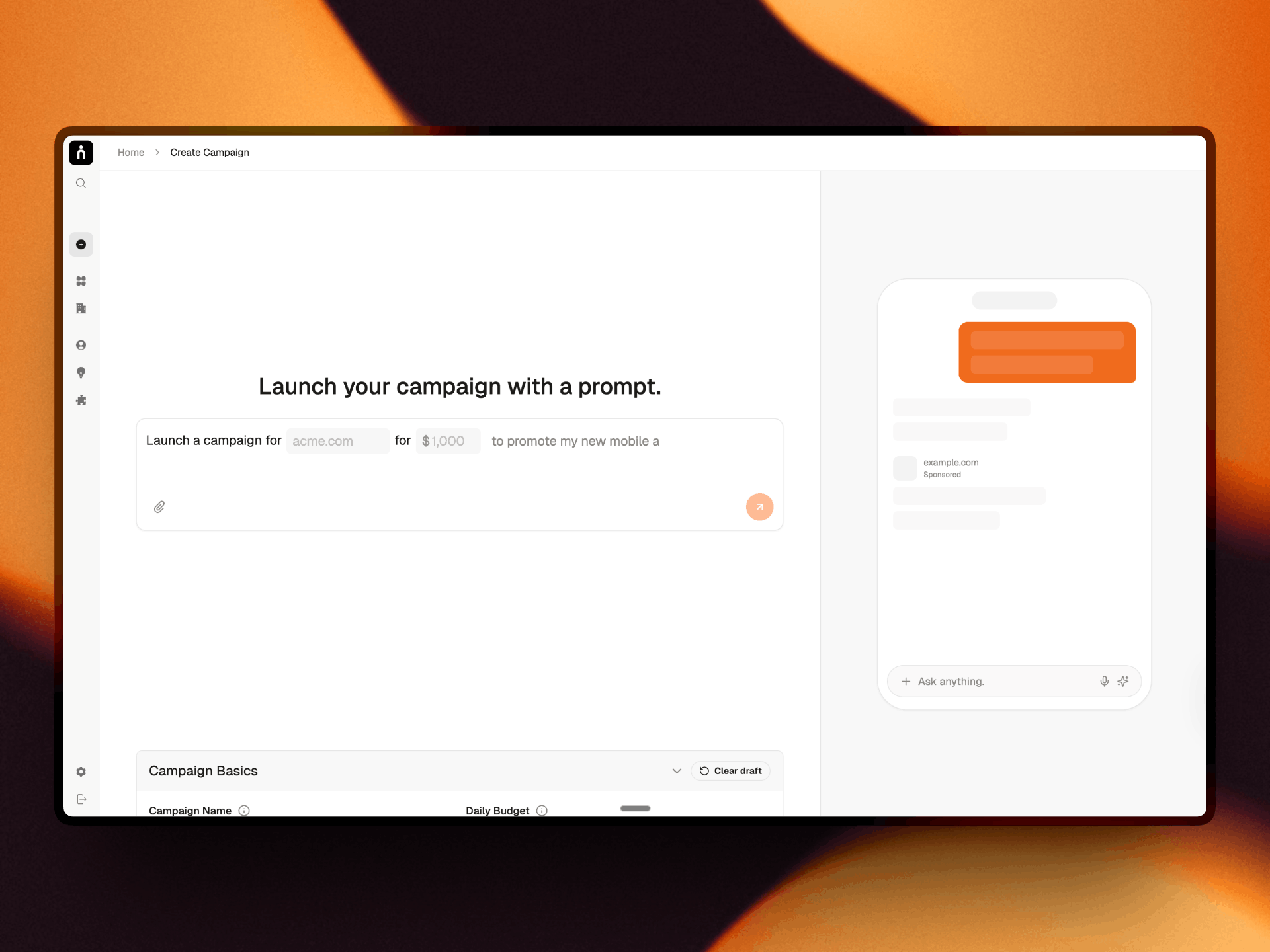
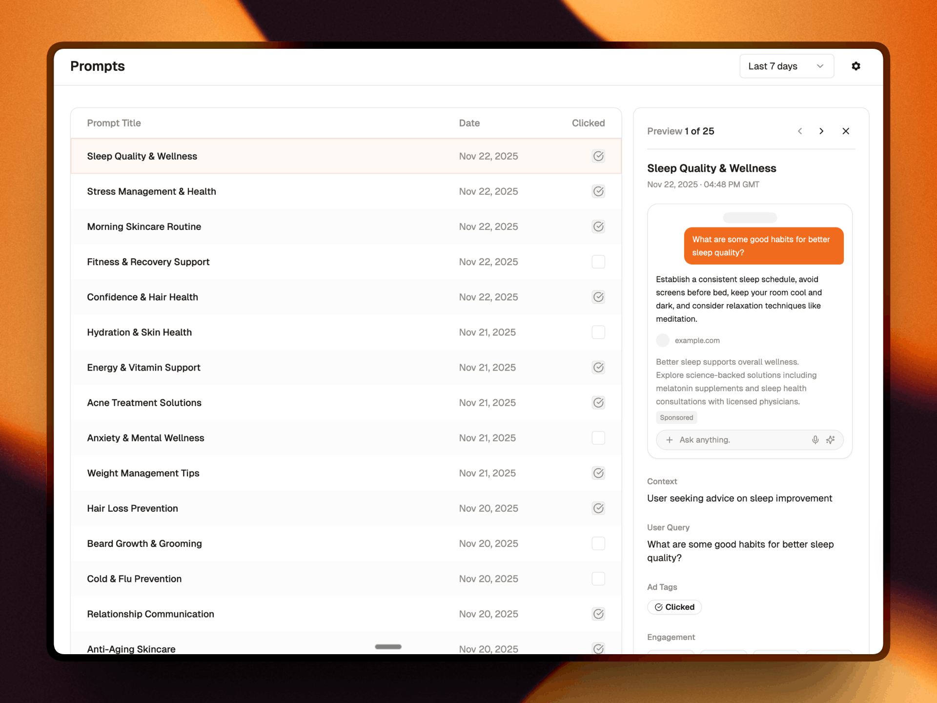
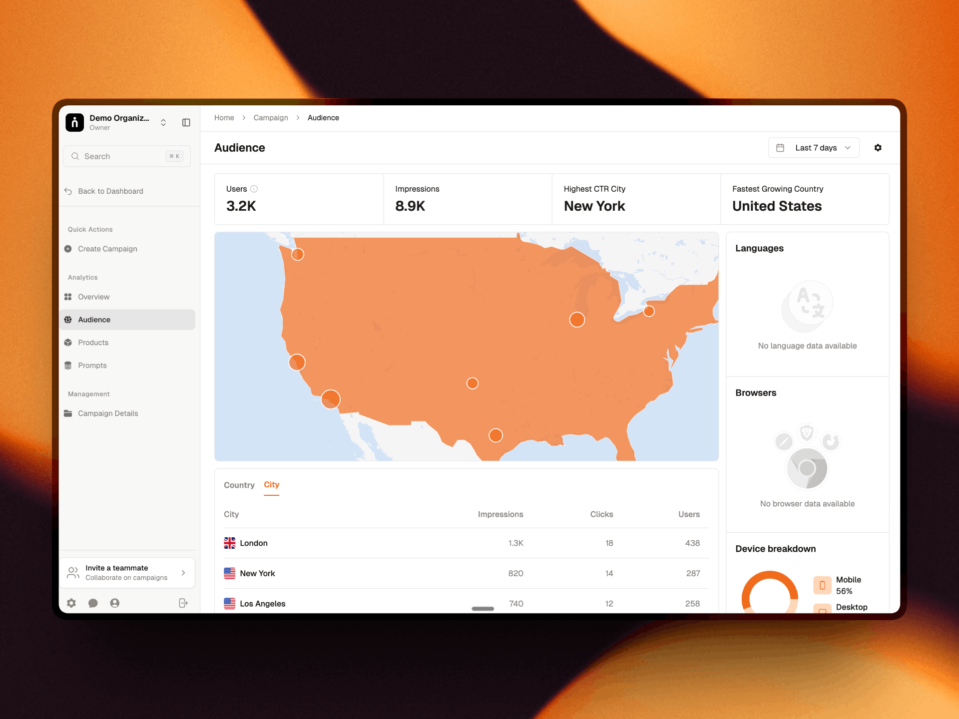
Luminocare is an AI operations platform in development for UK home care agencies. I designed and built the first frontend during the Redwood Founders programme, where we won demo day.
luminocare.co.ukLuminocare is an AI operations platform in development for UK home care agencies. The aim is to bring scheduling, carer onboarding, payroll and invoicing, and CQC compliance into one place. Its agents flag operational problems and suggest actions, but a person stays responsible for approving what happens next.
We built it during the eight-week Redwood Founders programme in London, and in September 2026 we won demo day: first of six finalists from a batch of about 40 teams. Three care agencies have signed pre-purchase agreements, conditional on full delivery. Today it is a clickable PWA prototype on mock data, with V1 targeted for December 2026.
Co-Founder and COO. I owned product design and built the first frontend, alongside operations, brand and content. I reviewed competitor interfaces, mapped flows in Figma, designed and built the first frontend, redesigned the agent page and audit trail, drafted the role-based access matrix, and made the demo video, pitch deck and brand.
Furqhan, our CEO, originated the idea and led sales and agency research. Min, our CTO, built the backend and agents, and later took on most of the frontend as the build grew.
The agencies we spoke to ran on spreadsheets, WhatsApp and older systems that stored information without helping coordinators act on it. Three examples made the cost concrete:
CQC is also moving from annual assessments towards more frequent spot checks, so agencies need to be inspection-ready all the time, not just before a visit.
The opportunity was not to add AI to another dashboard. It was to cut the manual coordination around a rota while keeping clear human accountability.
Furqhan had spoken to about 400 agencies before the programme. That gave us a wide problem space and only eight weeks. We cut scope to one agent, focused on scheduling, the most requested area in discovery calls.
I reviewed competitor interfaces including Birdie, Access Group and PCS to understand the patterns agencies already knew. I then mapped scheduling and onboarding flows in Figma and built the first frontend around a mock agency.
We scoped five core flows: a coordinator assigns a shift, a carer accepts or declines it, a patient sees who is coming, a guardian checks status, and a matching page suggests carers with reasons. We built it as a PWA rather than native apps, so we could iterate faster and cover iOS and Android with one codebase.
We chose defined, deterministic agent workflows over an autonomous chatbot. An agent can surface an issue or suggest an action, but a coordinator reviews and approves it. Clinical decisions are never auto-executed. In care, every action needs someone accountable, so the interface is built around quickly accessing, reviewing and approving.
Instead of hiding agents behind a chat window, the home page treats them like a staff room. Each agent has a card showing its status, last refresh, what it has done and what is still outstanding, so coordinators can see what the system has done before opening a workflow.
The schedule switches between Full (the complete rota), Issues only (exceptions that need attention) and Manual edit (drag and drop with AI switched off). The three states match different levels of trust: a coordinator can review exceptions without scanning the whole rota, or take direct control instead of being pushed through an AI suggestion.
Reviewing a suggestion often needs one small piece of supporting detail, and sending someone to another page breaks the flow. So detail expands where the decision is made. For example, a carer's weekly hours can reveal 37.5 contracted hours against 36.5 worked, with an inline shift breakdown.
Matching is a full page rather than a pop-up. Ranked carer cards show the reasoning and proximity behind each suggestion, with actions to confirm or swap. A map appears only on request, and bulk confirmation still allows an override for any single assignment. The goal is a match the coordinator can understand, check and change.
A conventional event log records events, but doesn't help someone reconstruct a decision. I redesigned the audit trail to read from trigger to resolution, with review points at each agent step and clearer states such as "reviewing" and "generated". It answers the compliance problem directly: finding out what happened shouldn't take a week.
We delayed the pilot for a second UI pass. After seeing the first version, we pushed the pilot back by one week. The manual UI came first, with AI layered into it, rather than using automation to cover an unresolved interface.
We made the demo safe to explore. Directors wanted to add and reset their own test data, and said they wouldn't upload real patient records at demo stage. We hid the CSV import and pilot metrics and focused on interactive, resettable mock data.
We shifted the story from time saved to capacity. An investor conversation challenged our focus on saving coordinator time. We reframed the proposition around helping agencies take on more clients, and avoided "replace your coordinator", which wouldn't land with agencies. Capacity is a hypothesis we still need to validate.
What exists today:
Three agencies signed pre-purchase agreements conditional on full delivery, and one agency director became a build advisor. There is no revenue or pilot data yet.
After demo day we started a leaner rebuild. The next build is design-system-first, followed by role-based access and core workflows, with each page tested with agencies in a build, show, ask loop. V1 is targeted for December 2026, with client go-live in January 2027.
Narrowing the scope was the most useful decision we made. We started with a platform that could cover scheduling, onboarding, payroll and compliance, and eight weeks forced us to make one workflow understandable. A small, coherent journey shows more than a wide set of half-resolved screens.
Showing work early changed the work. The first frontend gave the team something concrete to react to, and agency feedback exposed what our plan had missed: the UI needed another pass, demo data had to be safe and resettable, and capacity was a stronger story than time saved.
Designing AI for care is as much about accountability as automation. Human sign-off, reasons for matches and an audit trail are not extra screens around the agent. They are the product. The next test is whether those decisions hold up with real users and real data.
Abdussalam Popoola
England, UK
A design engineer obsessed with crafting & building aesthetic & useful software products.
Get in touch